Patient Demographics
Patient Demographics provides comprehensive demographic analysis and insights for patients in your cohort. This feature allows you to explore patient characteristics including age, gender, geographic distribution, race, and other demographic factors that help you understand your patient population.
Patient Demographics Interface
The Patient Demographics view is accessed by clicking on the "Patient Demographics" tab in the Cohort Analytics navigation bar. The interface displays your cohort name (e.g., "Cohort-Example-03") at the top with export options (PDF Export and PPT Export) on the right.
Navigation Tabs
The navigation bar provides access to the following views:
- Linked Cohort: View patient counts from multiple data sources
- Patient Demographics: Analyze patient demographic information (current tab)
- Line Of Therapies: Review treatment line information
- SOW: Access Statement of Work reports
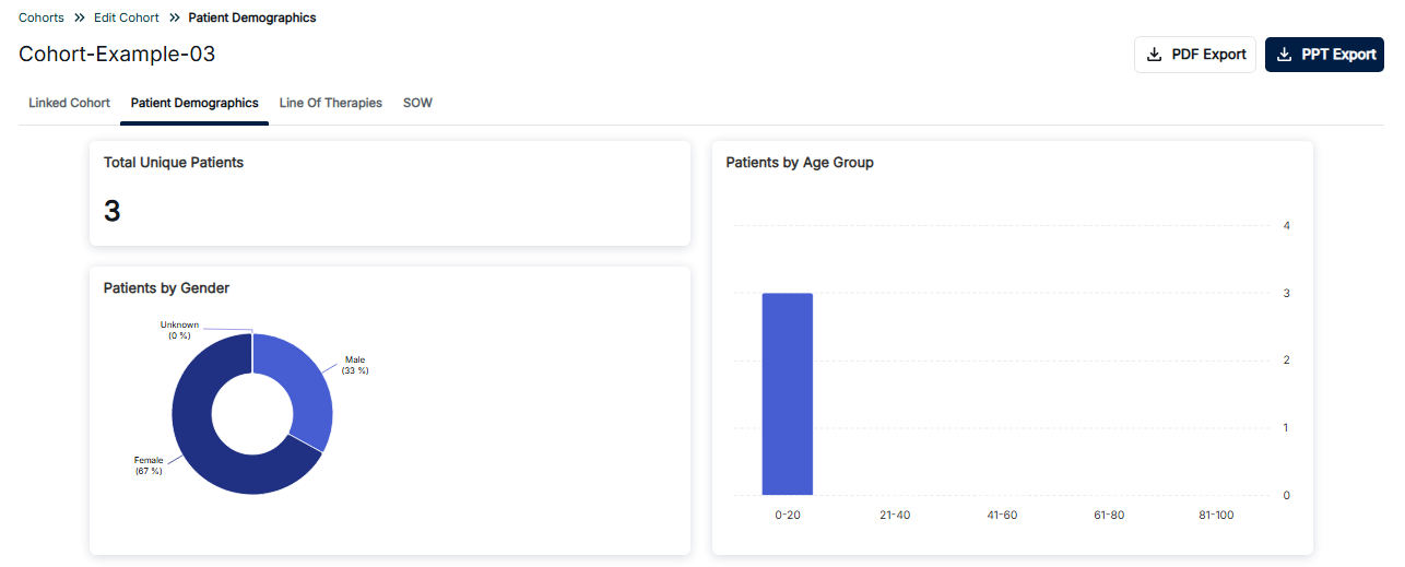
Patient Demographics - Overview with Gender and Age Distribution
Dashboard Components
Total Unique Patients
The top-left card displays the Total Unique Patients count (e.g., 3), providing a single numerical value representing the total number of distinct patients in your cohort.
Patients by Gender
The bottom-left card features a donut chart showing the gender distribution of patients:
- Female (67%): Shown in dark blue, representing the majority of the population
- Male (33%): Shown in lighter blue
- Unknown (0%): Patients with unspecified gender information
Patients by Age Group
The right card displays a vertical bar chart showing patient distribution across age ranges:
- 0-20: Pediatric and young adult patients (highest count in this example)
- 21-40: Young adult population
- 41-60: Middle-aged adults
- 61-80: Older adults
- 81-100: Elderly population
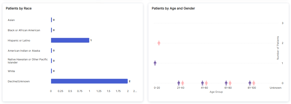
Patient Demographics - Race Distribution and Age by Gender
Patients by Race
The left card displays a horizontal bar chart showing patient counts by racial categories:
- Asian: 0 patients
- Black or African American: 0 patients
- Hispanic or Latino: 1 patient
- American Indian or Alaska: 0 patients
- Native Hawaiian or Other Pacific Islander: 0 patients
- White: 0 patients
- Decline/Unknown: 2 patients
Patients by Age and Gender
The right card features a scatter plot that combines age group and gender information:
- Female: Shown with pink person icons
- Male: Shown with purple person icons
- Age groups displayed on x-axis: 0-20, 21-40, 41-60, 61-80, 81-100, Unknown
- Number of patients shown on y-axis
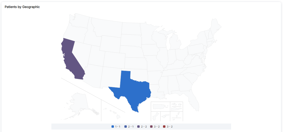
Patient Demographics - Geographic Distribution Map
Patients by Geographic Distribution
The geographic map visualization shows the distribution of patients across U.S. states. The map uses color coding to represent patient counts in different regions.
Map Features
- Color-Coded Legend: The legend at the bottom defines patient count ranges:
- Light Blue (1-1): States with 1 patient
- Medium Blue (2-1): States with 2 patients
- Purple (2-2): States with 2 patients (different range)
- Dark Red (3-2): States with 3 patients
- Bright Red (3-2): States with highest patient counts
- State Highlighting: In this example, California (purple) and Texas (blue) are highlighted showing patient presence
- Geographic Coverage: Includes contiguous United States, Alaska, Hawaii, and U.S. territories
Export Options
The Patient Demographics view provides two export options:
- PDF Export: Download the demographics report as a PDF document
- PPT Export: Download the demographics report as a PowerPoint presentation (highlighted in blue)
Key Features
- Total Unique Patients Count: Quick reference for total distinct patient population
- Gender Distribution: Donut chart showing percentage breakdown by gender
- Race Distribution: Horizontal bar chart comparing patient counts across racial categories
- Age Group Distribution: Vertical bar chart showing patient counts by age ranges
- Age and Gender Combined: Scatter plot showing intersection of age and gender
- Geographic Map: U.S. map showing patient distribution by state
- Export Options: PDF and PPT export capabilities
How to Access Patient Demographics
- Navigate to the Cohort Analytics section
- Select or open a cohort you want to analyze
- Click on the "Patient Demographics" tab in the navigation bar
- Review the Total Unique Patients count
- Examine the Patients by Gender donut chart
- Review the Patients by Age Group bar chart
- Scroll down to see Patients by Race and Age/Gender charts
- View the geographic distribution map
- Use PDF Export or PPT Export to download reports
Best Practices
- Review all visualization panels to understand your patient population
- Use the Total Unique Patients count as a reference point
- Pay attention to Decline/Unknown categories in race data
- Use the geographic map to identify regional patient concentrations
- Export reports for presentations and documentation
- Compare demographic distributions across different cohorts