Line of Therapies
Line of Therapies analysis tracks the sequence of treatment lines that patients receive over time. This feature helps you understand treatment progression, therapy switches, and treatment patterns within your cohort.
Line of Therapies Interface
The Line of Therapies view is accessed by clicking on the "Line Of Therapies" tab in the Cohort Analytics navigation bar. The interface displays your cohort name at the top with export options (PDF Export and PPT Export) on the right.
Navigation Tabs
The navigation bar provides access to the following views:
- Linked Cohort: View patient counts from multiple data sources
- Patient Demographics: Analyze patient demographic information
- Line Of Therapies: Review treatment line information (current tab)
- SOW: Access Statement of Work reports
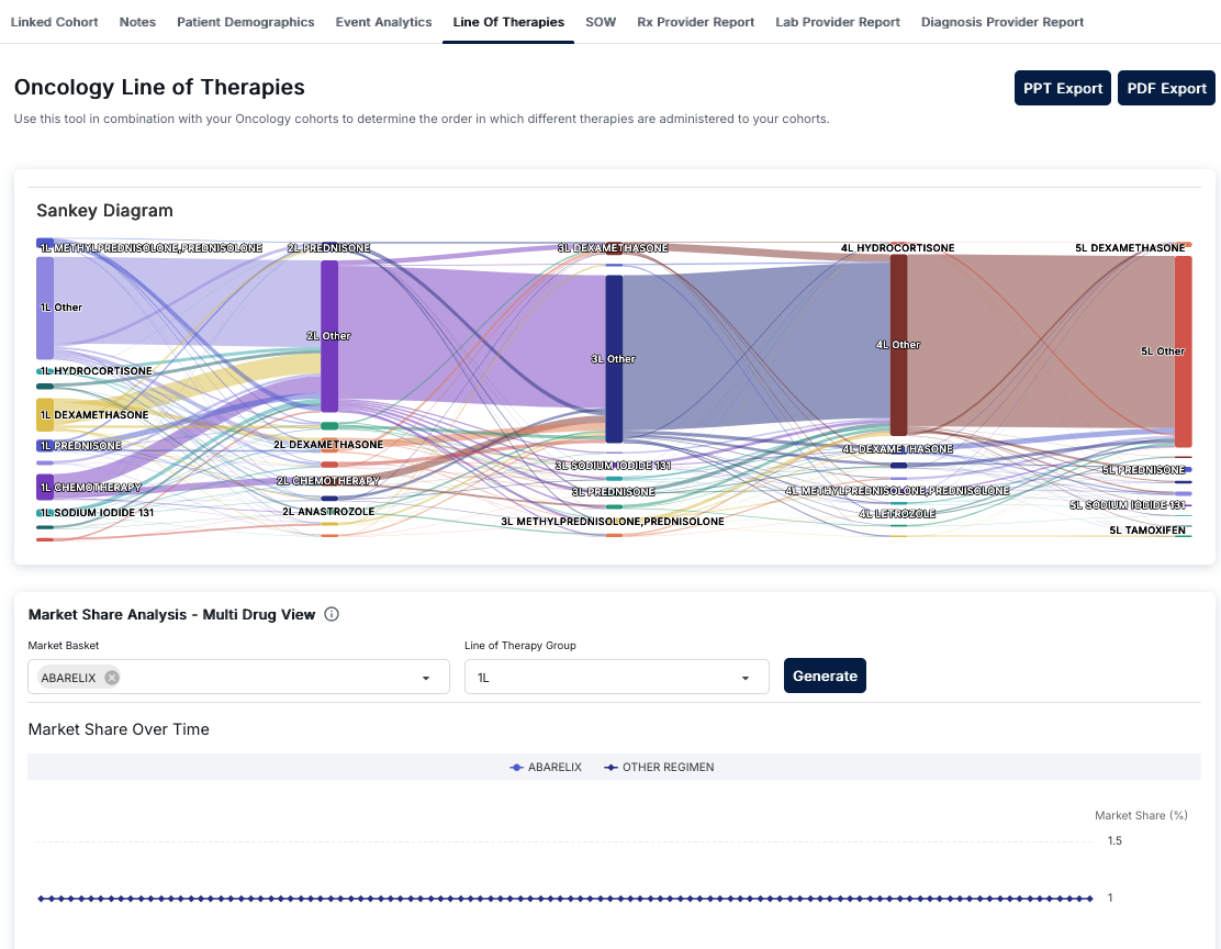
Line of Therapies - Sankey Diagram showing therapy progression
Sankey Diagram
The main visualization is a Sankey Diagram that illustrates the progression of therapies across treatment lines. This flow diagram shows:
- Treatment Lines: Vertical columns representing sequential therapy lines (1L, 2L, 3L, etc.)
- Therapy Nodes: Rectangular nodes representing specific therapies or therapy categories
- Flow Connections: Colored lines connecting therapy nodes between adjacent stages
- Volume Indicators: The width of nodes and connecting lines indicates patient volume
Understanding Therapy Lines
Each therapy line represents a sequential stage of treatment:
- 1L (First Line): Initial therapies patients receive
- 2L (Second Line): Therapies after first-line treatment
- 3L (Third Line): Subsequent therapies after second-line
- 4L+ (Fourth Line and beyond): Later-stage therapies
Interpreting the Sankey Diagram
The Sankey diagram helps you understand:
- Therapy Sequences: Which therapies patients progress to after each treatment line
- Patient Flow: How many patients move from one therapy to another
- Common Pathways: The most frequent therapy progression patterns
- Treatment Patterns: Whether patients continue or switch therapies
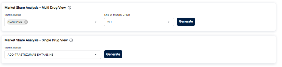
Market Share Analysis - Configuration and Chart
Market Share Analysis
The Market Share Analysis section provides tools to analyze drug market share over time:
Configuration Controls
- Market Basket: Dropdown to select specific drugs to analyze
- Line of Therapy Group: Select which therapy line to analyze (1L, 2L, etc.)
- Generate Button: Process selections and generate the analysis
Market Share Over Time Chart
The chart displays market share trends:
- Line Chart: Time-series visualization of market share
- X-Axis: Time period
- Y-Axis: Market share percentage
- Legend: Color-coded series for selected drugs
Export Options
The Line of Therapies view provides two export options:
- PDF Export: Download the analysis as a PDF document
- PPT Export: Download the analysis as a PowerPoint presentation
Key Features
- Sankey Diagram: Visual flow diagram showing therapy progression
- Therapy Flow Analysis: See how patients move between therapies
- Market Share Analysis: Compare drug market share over time
- Line-Specific Analysis: Analyze specific therapy lines
- Export Capabilities: Export to PDF or PowerPoint
How to Use Line of Therapies
- Navigate to the Cohort Analytics section and select a cohort
- Click on the "Line Of Therapies" tab
- Review the Sankey Diagram to understand therapy progression
- Use Market Share Analysis to compare drug trends:
- Select drugs in the Market Basket dropdown
- Choose a Line of Therapy Group
- Click Generate to create the chart
- Export your analysis using PDF or PPT Export buttons
Best Practices
- Use the Sankey diagram to identify common therapy progression patterns
- Compare market share trends across different therapy lines
- Export analyses for presentations and documentation
- Track changes in therapy patterns over time