Patient Demographics
Patient Demographics provides comprehensive demographic analysis and insights for patients in your cohort. This feature allows you to explore patient characteristics including age, gender, geographic distribution, race, and other demographic factors that help you understand your patient population.
Patient Demographics Dashboard
The Patient Demographics dashboard provides a comprehensive visual overview of your cohort's demographic composition. Access this view by clicking on the "Patient Demographics" tab in the Cohort Analytics navigation bar. The dashboard displays multiple visualization panels that help you understand the characteristics of your patient population.
Dashboard Components
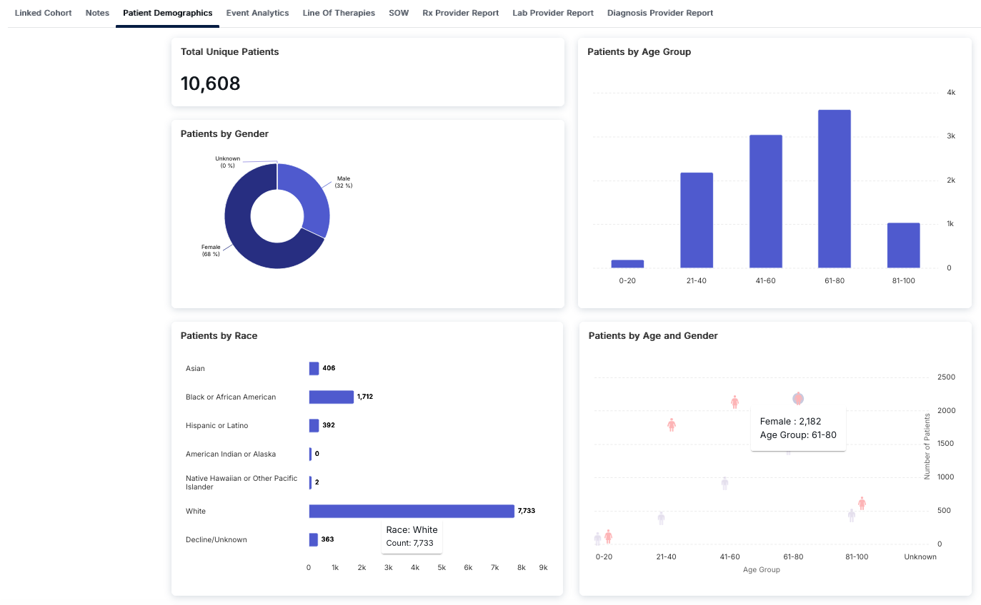
The Patient Demographics dashboard consists of four main visualization panels:
Total Unique Patients
The top-left card displays the Total Unique Patients count, providing a single numerical value representing the total number of distinct patients in your cohort. This metric accounts for patient deduplication across all data sources.
Patients by Gender
The middle-left card features a donut chart showing the gender distribution of patients:
- Female: Typically the largest segment, often representing 60-70% of the population
- Male: Usually the second largest segment, representing approximately 30-40%
- Unknown: Patients with unspecified or missing gender information
The chart uses color coding (dark blue for the majority gender, lighter blue for the minority) to make the distribution easy to understand at a glance.
Patients by Race
The bottom-left card displays a horizontal bar chart showing patient counts by racial categories:
- White: Typically the largest category
- Black or African American: Second largest category in many cohorts
- Asian: Smaller but significant population
- Hispanic or Latino: Ethnic category representation
- American Indian or Alaska Native: Often smaller populations
- Native Hawaiian or Other Pacific Islander: Typically very small populations
- Decline/Unknown: Patients who declined to specify or have missing race information
The horizontal bar chart makes it easy to compare patient counts across different racial categories, with the x-axis showing the count scale.
Patients by Age Group
The top-right card displays a vertical bar chart showing patient distribution across age ranges:
- 0-20: Pediatric and young adult patients
- 21-40: Young adult population
- 41-60: Middle-aged adults
- 61-80: Older adults (often the largest group in many cohorts)
- 81-100: Elderly population
The vertical bar chart allows you to quickly identify which age groups are most represented in your cohort, with the y-axis showing patient counts.
Patients by Age and Gender
The bottom-right card features a scatter plot that combines age group and gender information, providing a comprehensive view of how gender distribution varies across different age ranges:
- Each age group shows separate data points for Female (pink symbol) and Male (purple symbol)
- The y-axis represents the number of patients, allowing you to see both the total count and gender breakdown for each age group
- This visualization helps identify age-specific gender patterns in your cohort
The scatter plot provides insights into how demographic characteristics intersect, which is valuable for understanding population composition and planning targeted interventions.
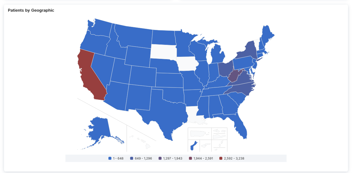
Patients by Geographic Distribution
The geographic map visualization shows the distribution of patients across U.S. states and territories. The map uses a color gradient to represent patient count ranges, making it easy to identify regions with higher or lower patient concentrations.
Map Features
- Color-Coded Legend: The legend at the bottom defines five patient count ranges:
- Lightest Blue: 1 - 648 patients
- Medium Blue: 649 - 1,296 patients
- Purple: 1,297 - 1,943 patients
- Dark Red: 1,944 - 2,591 patients
- Bright Red: 2,592 - 3,238 patients (highest range)
- Geographic Coverage: The map includes:
- Contiguous United States (main map)
- Alaska (inset map below the western U.S.)
- Hawaii (inset map below Alaska)
- U.S. territories (Puerto Rico, Guam, U.S. Virgin Islands, American Samoa, Northern Mariana Islands) shown in a grouped inset
- State-Level Data: Each state is color-coded based on its patient count, allowing you to quickly identify:
- States with the highest patient concentrations (darker red colors)
- States with moderate patient counts (blue and purple colors)
- States with lower patient counts (lighter blue colors)
- Regions with no data (white, typically territories)
Interpreting Geographic Distribution
The geographic map helps you understand:
- Regional Patterns: Identify geographic clusters of patients, which may reflect population density, healthcare access, or disease prevalence
- State-Level Concentration: See which states have the highest patient counts (e.g., California often shows the highest concentration)
- Coverage Gaps: Identify regions with lower patient representation, which may indicate data collection limitations or actual population differences
- Territory Representation: Understand which U.S. territories are included in your cohort data
This visualization is particularly useful for:
- Regional healthcare planning and resource allocation
- Understanding geographic diversity of your patient population
- Identifying potential regional variations in treatment patterns or outcomes
- Planning multi-site studies or regional interventions
Understanding Patient Demographics
Patient Demographics analysis provides detailed breakdowns of your cohort's demographic composition, enabling you to understand the characteristics of your patient population. This information is essential for population health studies, clinical research, and healthcare planning.
Key Features
- Total Unique Patients Count: Quick reference for total distinct patient population
- Gender Distribution Visualization: Donut chart showing percentage breakdown by gender
- Race Distribution Analysis: Horizontal bar chart comparing patient counts across racial categories
- Age Group Distribution: Vertical bar chart showing patient counts by age ranges
- Age and Gender Combined View: Scatter plot showing intersection of age and gender demographics
- Interactive Visualizations: All charts are interactive and provide detailed information on hover
- Tabbed Navigation: Access other analytical views (Notes, Event Analytics, etc.) from the same interface
How to Access Patient Demographics
- Navigate to the Cohort Analytics section
- Select or open a cohort you want to analyze
- Click on the "Patient Demographics" tab in the top navigation bar
- Review the dashboard with all four visualization panels
- Examine each chart to understand different aspects of your patient population
- Use the scatter plot to identify age-specific gender patterns
- Compare demographic distributions to understand your cohort composition
- Access other tabs (Notes, Event Analytics, Line Of Therapies, etc.) for additional insights
Interpreting the Visualizations
Each visualization panel provides unique insights:
- Total Unique Patients: Use this as a baseline metric to understand your cohort size
- Gender Distribution: Helps identify gender imbalances that may affect study design or outcomes
- Race Distribution: Important for understanding population diversity and ensuring representative samples
- Age Group Distribution: Critical for understanding the age profile of your cohort, which may impact treatment patterns and outcomes
- Age and Gender Combined: Reveals how gender distribution varies by age, which can be important for age-stratified analyses
Best Practices
- Review all four visualization panels to get a comprehensive understanding of your patient population
- Use the Total Unique Patients count as a reference point when analyzing other metrics
- Pay attention to missing or unknown data categories (gender, race) as they may affect analysis validity
- Compare demographic distributions across different cohorts to identify population differences
- Consider demographic factors when interpreting clinical outcomes and treatment effectiveness
- Use the age and gender combined view to identify potential age-specific gender patterns
- Document demographic characteristics when reporting study results or cohort descriptions