Line of Therapeutic
Line of Therapeutic analysis tracks the sequence of treatment lines that patients receive over time. This feature helps you understand treatment progression, therapy switches, and treatment patterns within your cohort, providing insights into patient care journeys and therapeutic decision-making.
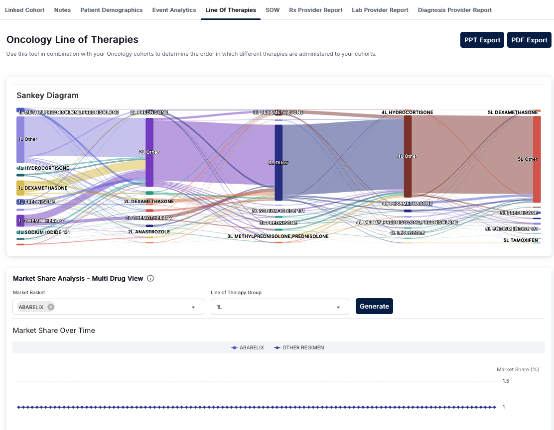
Oncology Line of Therapies Interface
The Oncology Line of Therapies tool helps determine the order in which different therapies are administered to oncology cohorts. Access this view by clicking on the "Line Of Therapies" tab in the Cohort Analytics navigation bar. The interface provides visual representations of therapy progression and market share analysis.
Export Options
At the top right of the interface, you'll find two export buttons:
- PPT Export: Export the analysis to a PowerPoint presentation format
- PDF Export: Export the analysis to a PDF document format
These export options allow you to share your line of therapy analysis with stakeholders or include it in reports.
Sankey Diagram
The main visualization is a Sankey Diagram that illustrates the progression of therapies across five treatment lines (1L through 5L). This flow diagram shows:
- Treatment Lines: Five vertical columns representing first-line (1L) through fifth-line (5L) therapies
- Therapy Nodes: Each column contains rectangular nodes representing specific therapies or therapy categories
- Flow Connections: Colored lines connecting therapy nodes between adjacent stages, showing patient flow from one therapy to the next
- Volume Indicators: The width of nodes and connecting lines indicates the volume or proportion of patients
Understanding Therapy Lines
Each therapy line represents a sequential stage of treatment:
- 1L (First Line): Initial therapies patients receive, including:
- METHYLPREDNISOLONE, PREDNISOLONE
- HYDROCORTISONE
- DEXAMETHASONE
- PREDNISONE
- CHEMOTHERAPY
- SODIUM IODIDE 131
- Other therapies
- 2L (Second Line): Therapies patients receive after first-line treatment, including:
- PREDNISONE
- DEXAMETHASONE
- CHEMOTHERAPY
- ANASTROZOLE
- Other therapies
- 3L (Third Line): Subsequent therapies after second-line treatment
- 4L (Fourth Line): Therapies after third-line treatment, including LETROZOLE
- 5L (Fifth Line): Later-stage therapies, including TAMOXIFEN
Interpreting the Sankey Diagram
The Sankey diagram helps you understand:
- Therapy Sequences: Which therapies patients progress to after each treatment line
- Patient Flow: How many patients move from one therapy to another (indicated by line thickness)
- Common Pathways: The most frequent therapy progression patterns
- Treatment Patterns: Whether patients continue on similar therapies or switch to different treatment types
For example, you might see a thick purple line flowing from "1L METHYLPREDNISOLONE, PREDNISOLONE" to "2L PREDNISONE" and then to "3L DEXAMETHASONE," indicating a common treatment pathway. A prominent yellow line from "1L DEXAMETHASONE" to "2L DEXAMETHASONE" shows patients continuing on the same therapy.
Market Share Analysis - Multi Drug View
The bottom section provides Market Share Analysis functionality with a multi-drug view:
Configuration Controls
- Market Basket: A dropdown menu for selecting specific drugs or drug combinations to analyze. Selected drugs appear as tags (e.g., "ABARELIX") with an 'x' icon to remove them. You can select multiple drugs to compare their market share.
- Line of Therapy Group: A dropdown menu to select which therapy line to analyze (e.g., "1L", "2L", "3L", etc.)
- Generate Button: A dark blue button that processes your selections and generates the market share analysis
Market Share Over Time Chart
Below the configuration controls, the "Market Share Over Time" chart displays:
- Line Chart: A time-series visualization showing market share trends
- Legend: Color-coded series for each selected drug (e.g., "ABARELIX" with blue diamond markers) and "OTHER REGIMEN" (gray circle markers) representing all other therapies
- X-Axis: Represents time with evenly spaced markers
- Y-Axis: Shows "Market Share (%)" on the right side, typically ranging from 0% to higher values
- Data Points: Each selected drug appears as a line with distinct markers (diamonds, circles, etc.)
This chart helps you understand:
- How market share for specific drugs changes over time
- Trends in therapy adoption and usage patterns
- Comparison between selected drugs and other regimens
- Temporal patterns in treatment selection
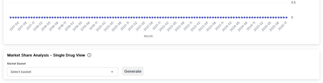
Market Share Analysis - Single Drug View
The Market Share Analysis - Single Drug View provides a focused analysis of a single drug's market share over time. This view is useful for detailed analysis of individual therapy performance.
Line Chart Visualization
The top section displays a line chart showing market share trends:
- Y-Axis: Represents market share values, typically ranging from 0 to higher values (e.g., 0 to 0.5 or higher)
- X-Axis: Represents time in months, labeled as "Month" with date ranges (e.g., from "2017-04" to "2025-11")
- Time Labels: Month labels appear approximately every three months (e.g., 2017-04, 2017-08, 2017-11, 2018-02, etc.)
- Data Series: A single blue line with circular blue markers at each data point
- Trend Visualization: The line shows how market share changes over the selected time period
The chart provides a clear view of:
- Long-term market share trends for the selected drug
- Seasonal or periodic variations in market share
- Growth or decline patterns over extended time periods
- Stability or volatility in market share
Control Panel
Below the chart, the "Market Share Analysis - Single Drug View" control panel includes:
- Market Basket: A dropdown input field labeled "Select basket" that allows you to choose a specific drug or drug combination to analyze. This is a single-selection dropdown, unlike the multi-drug view.
- Generate Button: A button that processes your selection and generates the market share chart for the selected drug
- Information Icon: A small icon next to the section title that provides additional information about the single drug view functionality
Using Single Drug View
The Single Drug View is particularly useful for:
- Detailed Analysis: Focus on one specific drug's market share performance without the complexity of multiple comparisons
- Long-Term Trends: Analyze market share trends over extended periods (e.g., 2017-2025)
- Performance Tracking: Monitor how a specific therapy's market share evolves over time
- Simplified Visualization: Get a clear, uncluttered view of a single drug's market share trajectory
This view complements the Multi Drug View by providing focused analysis when you need to examine individual drug performance in detail.
Understanding Line of Therapeutic
Line of Therapeutic refers to the sequential order of treatments a patient receives. The first treatment is considered "first line," the next treatment after a switch is "second line," and so on. This analysis helps track treatment progression and understand treatment patterns.
Key Features
- Sankey Diagram Visualization: Interactive flow diagram showing therapy progression across five treatment lines
- Therapy Flow Analysis: Visual representation of how patients move between different therapies
- Volume Indicators: Node and line widths indicate patient volume and proportions
- Market Share Analysis: Compare market share of specific drugs over time
- Multi-Drug Comparison: Select multiple drugs to compare their market share trends
- Line-Specific Analysis: Analyze market share for specific therapy lines (1L, 2L, 3L, etc.)
- Export Capabilities: Export analyses to PowerPoint or PDF formats
- Time-Series Trends: View how market share changes over time for selected therapies
How to Use Line of Therapeutic
- Navigate to the Cohort Analytics section and select an oncology cohort
- Click on the "Line Of Therapies" tab in the top navigation bar
- Review the Sankey Diagram to understand therapy progression patterns:
- Examine the flow from 1L therapies to subsequent lines
- Identify common therapy sequences and pathways
- Note the thickness of connecting lines to understand patient volumes
- Use the Market Share Analysis section:
- Select one or more drugs in the "Market Basket" dropdown
- Choose a "Line of Therapy Group" (e.g., "1L", "2L")
- Click "Generate" to create the market share chart
- Analyze the "Market Share Over Time" chart:
- Review trends for selected drugs
- Compare selected drugs with "OTHER REGIMEN"
- Identify temporal patterns in therapy adoption
- Export your analysis using "PPT Export" or "PDF Export" buttons
Interpreting Therapy Progression
The Sankey diagram provides insights into:
- First-Line Patterns: Which therapies are most commonly used as initial treatment
- Sequencing Logic: How therapies are sequenced after first-line treatment
- Continuation vs. Switching: Whether patients continue on similar therapies or switch to different treatment types
- Patient Retention: How many patients progress through multiple treatment lines
- Treatment Pathways: Common routes patients take through different therapy lines
Thicker connecting lines indicate more patients following that specific therapy progression pathway, while thinner lines represent less common pathways.
Best Practices
- Use the Sankey diagram to identify the most common therapy progression patterns in your cohort
- Compare market share trends across different therapy lines to understand treatment evolution
- Select multiple drugs in the Market Basket to compare competitive positioning
- Analyze market share over time to identify trends, growth, or decline in specific therapies
- Export analyses regularly to track changes in therapy patterns over time
- Use the tool in combination with your oncology cohorts to validate treatment sequencing logic
- Document therapy line definitions and progression rules for consistency across analyses
- Consider patient characteristics and outcomes when interpreting therapy progression patterns